One of the best things about a brand is its logo design. What’s more interesting is the logo design trends gaining immense popularity among the business community and the consumers.
The global designer’s community thinks that these ten logo design trends will definitely dominate the market this year, 2022. After review, it’s found that this year will witness more or less constrained, bolder logos – logos explicitly designed for the world recovering from the pandemic’s impacts.
Here are the logo design trends that are carving out and shaping the business world into a new aesthetic definition.
Table of Contents
Retro Rubber Hose Logo Design
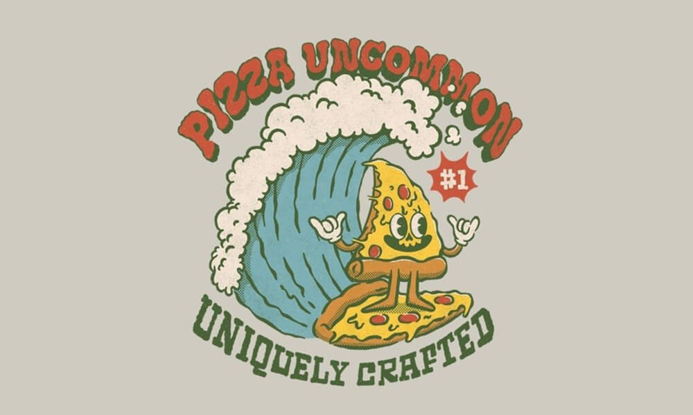
If you brush the memory, you’ll remember that you’ve already seen rubber hose imagery. If you’ve ever seen a cartoon made in the 1920s or 30s or played Bendy or Cuphead, you’ll remember seeing a rubber hose animation.
What’s more, you’ll see a lot of it in 2022 in the logos. In contrast to the black and white cartoons from the 1920s, 2022 will see this animation in the form of colorful logos. These character logos enable brands to be more personalized and more human.
Blurred Logo Design
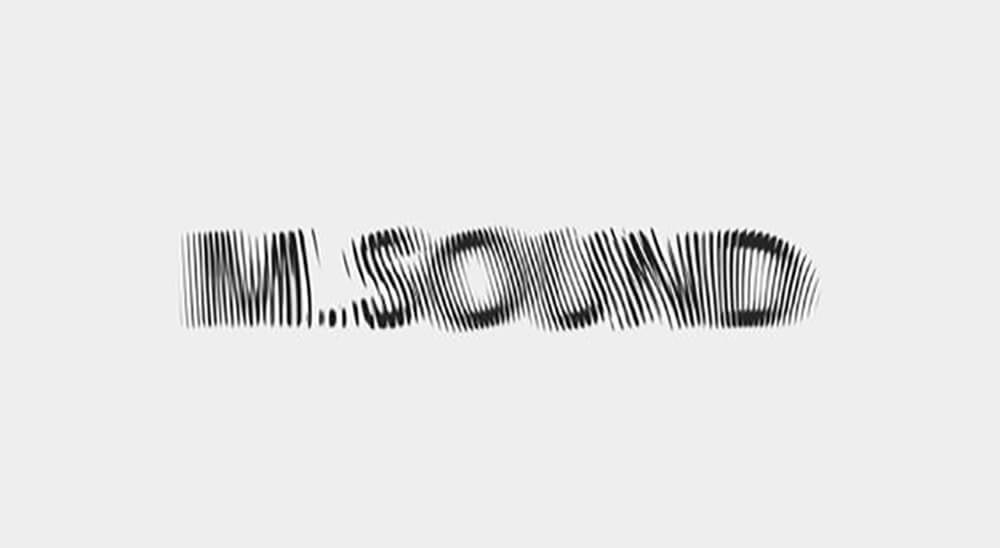
Need to make an iconic logo design? A blurred logo is a way to go. Designers are now experimenting with blur effects to give more focus on movement and fluidity rather than prioritizing the readability of the logo’s text.
In this logo, you’ll find the main body of the word clear while the letter’s edges are blurred. However, you can also provide your brand name in a clearly printed way to accompany the blurred logo so that the reader never gets confused about your brand identity.
Stretched and Consistent Lettering
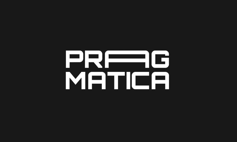
Apart from blurred logos, you’ll see distortions in logo design with the latest trend of stretched and consistent lettering for an infinite, delicate look and finish. These logos come with curves.
Some curves may seem like strands of spaghetti. These logos may also come with one or two letters that are stretched while the others stay regular-sized. It will attract the viewers to those stretched letters only.
McBling
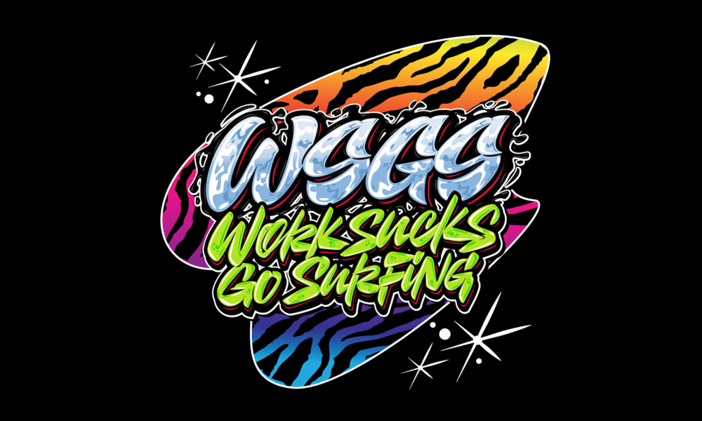
This logo trend hits the nostalgic chord of the 2000s. Evan Collins first dubbed this logo style in 2006. McBling is an aesthetically-appealing logo that glorifies and extends the stylistic and attractive features from the 2000s.
From gothic fonts to cultural obsessions with pink color, everything about this logo design makes it highly appealing.
Scribbles & Sketches
You already know how some website designers use aesthetics from the past decades to make their logo designs. In contrast, other designers do their best to bring nostalgia into their logo designs: scribbly, shaky, child-like art. Surprisingly, this year will see a lot of scribbles.
You’ll find logos with an unfinished, rough look rather than seeing a clean and well-produced logo. Although scribbles and sketches are raw, they ensure minimalism and sophistication.
Line Thickness
There’s no doubt that a logo design sticks with your brand, through thick and thin! In 2022, this statement will come into action. You’ll see a lot of logo designs that come with different line thicknesses.
This enables designers to provide extra depth and complexity in their work. These logos resemble a futuristic vision and have a dynamic feel.
White Space Logo Designs
If your logo has white space, also referred to as negative space, it will often stay blank. Designers can enable a “setting” for your logo’s focal point with this blank space. It also helps designers to balance their composition to avoid any cluttered look.
This type of logo is exceptionally versatile, which is one of the reasons why it’s so appealing to brands. This customizable white space logo will help you switch your logo’s look easily and efficiently.
The Groovy Revival Logo Design
One common theme that goes on for years in logo design trends is the need for aesthetic references from the 70s groovy years. Although the trend is retro, you get a sleek and futuristic feel.
In these logos, you’ll find the fonts to bubble up into softie styles or melt into curvy letterforms. Also, the logo comes with flashy, bright colors in contrast to the minimal layouts.
Layered Elements
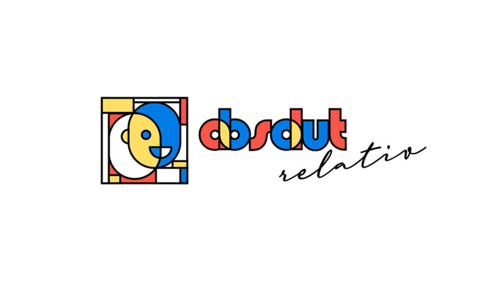
Logos with layered elements is one of the vital logo design trends that will hit the market in 2022. Here, designers incorporate geometric fonts, forms, and color that blends to make classic logos. This logo design will bring abrupt pattern and color changes to provide something unique and visually-pleasing.
Typography Becomes The Trend

Once again, logos with letters personifying their brands have become the trend. Wordmark logos have become the center of attraction yet again.
You can find these logos with the typography focusing on the imagery and ensuring an emblem-shaped logo or the typography getting snuggled within the imagery to provide logos with shape and structure. These logos are the perfect example of graphics and texts working together.
Final Words
In 2022, logo design trends will bring nostalgia from different art styles and decades. If you’re looking for logo design inspiration this year, it’s good to look into the past. By considering what worked before, you can redefine and recreate them into something more appealing than anyone can imagine.
So, take inspiration from these logo design trends above and start today.
